close
REX Animal Health
A new marketing site for a startup revolutionizing the animal health space
devices Web DevelopmentMy friends at Rex Animal Health were looking to launch a sexy new website ahead of their participation in the TechCrunch Disrupt Startup Battlefield. In our time together at the Sprint Accelerator in Kansas City, they’d gotten a good feel for my design style and visual aesthetic, so they entrusted me with designing their new site. The process, as I lay out below, was fairly straightforward. I started with a few rounds of interviews and feedback sessions to scope the project and understand the intent of the new site. Using this information I put together some wireframes and simple mockups in a handful of visual styles.
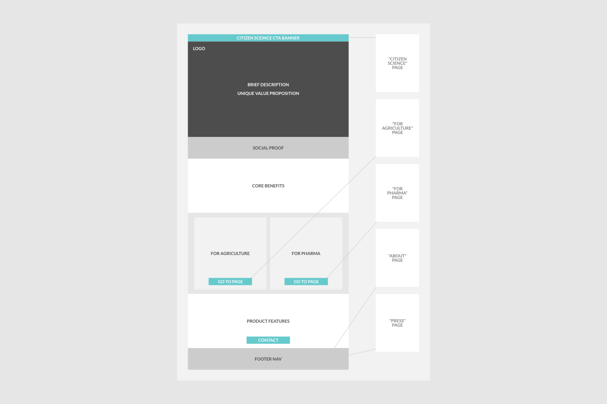
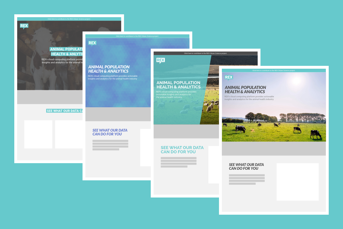
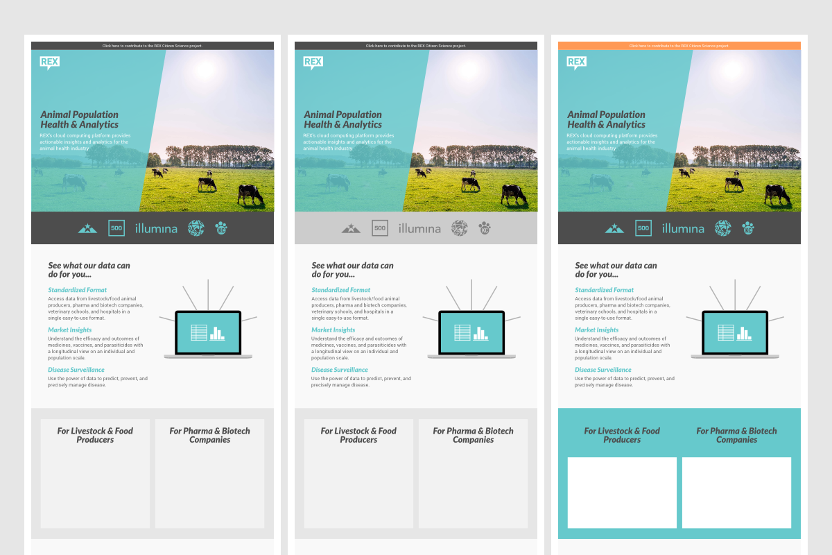
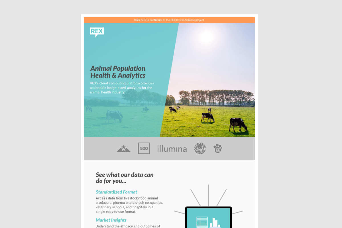
After several rounds of feedback and mockups, we had landed on a final design, and I began coding the actual site to allow for hands-on evaluation and feedback. Throughout the project, I enjoyed a tremendous amount of freedom to edit their copy for clarity and impact, as well as flexibility to use my judgment in setting the visual style. The final result looks great, and, more importantly, presents their complex and varied value propositions in clear simple terms for their target customers. With a focus on the clarity of the content, we didn’t get too wild with the design. However, the colored “slash” banner is bold and unique, and we got creative with the menu to take advantage of available screen real estate on larger devices.
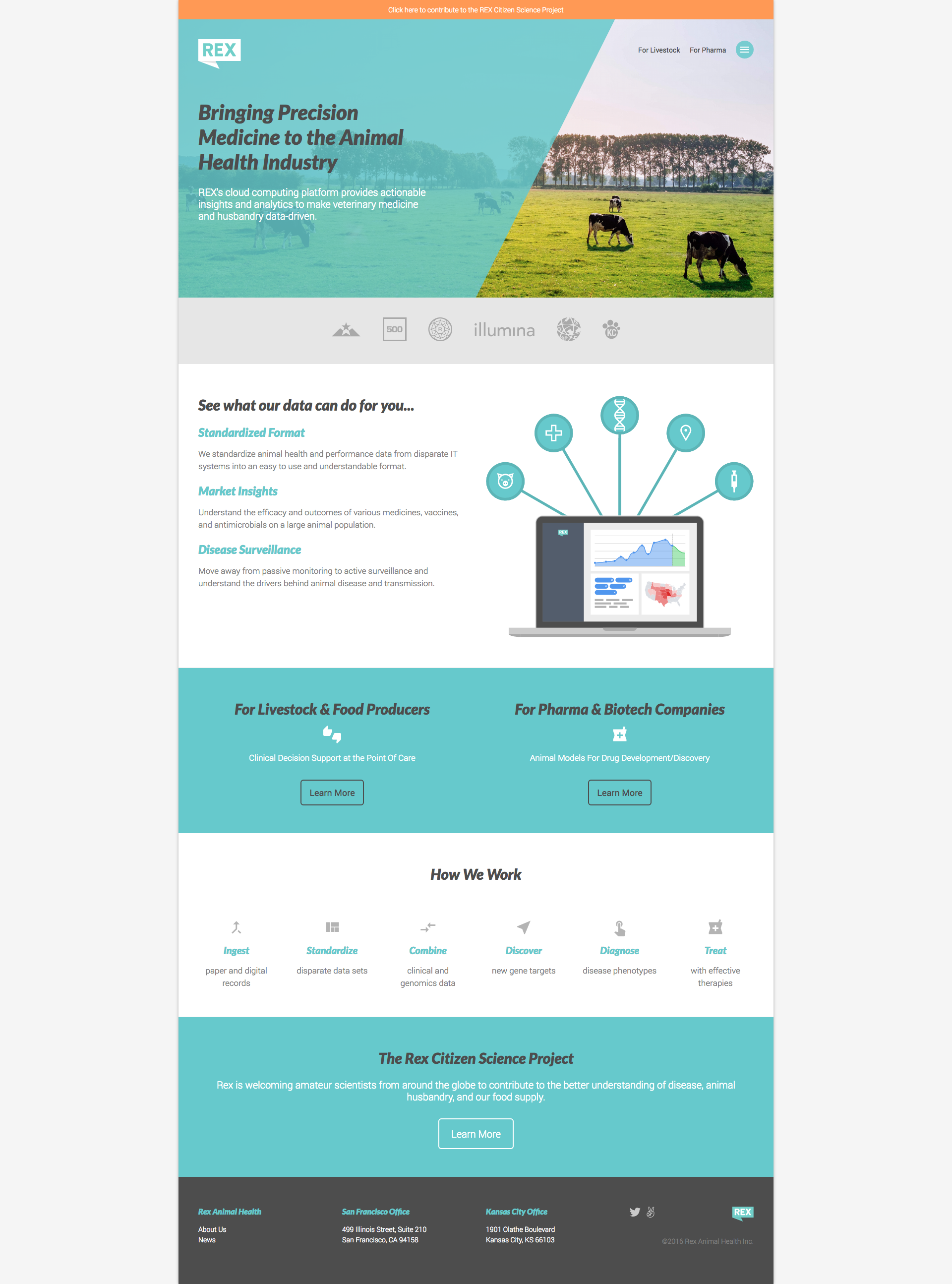
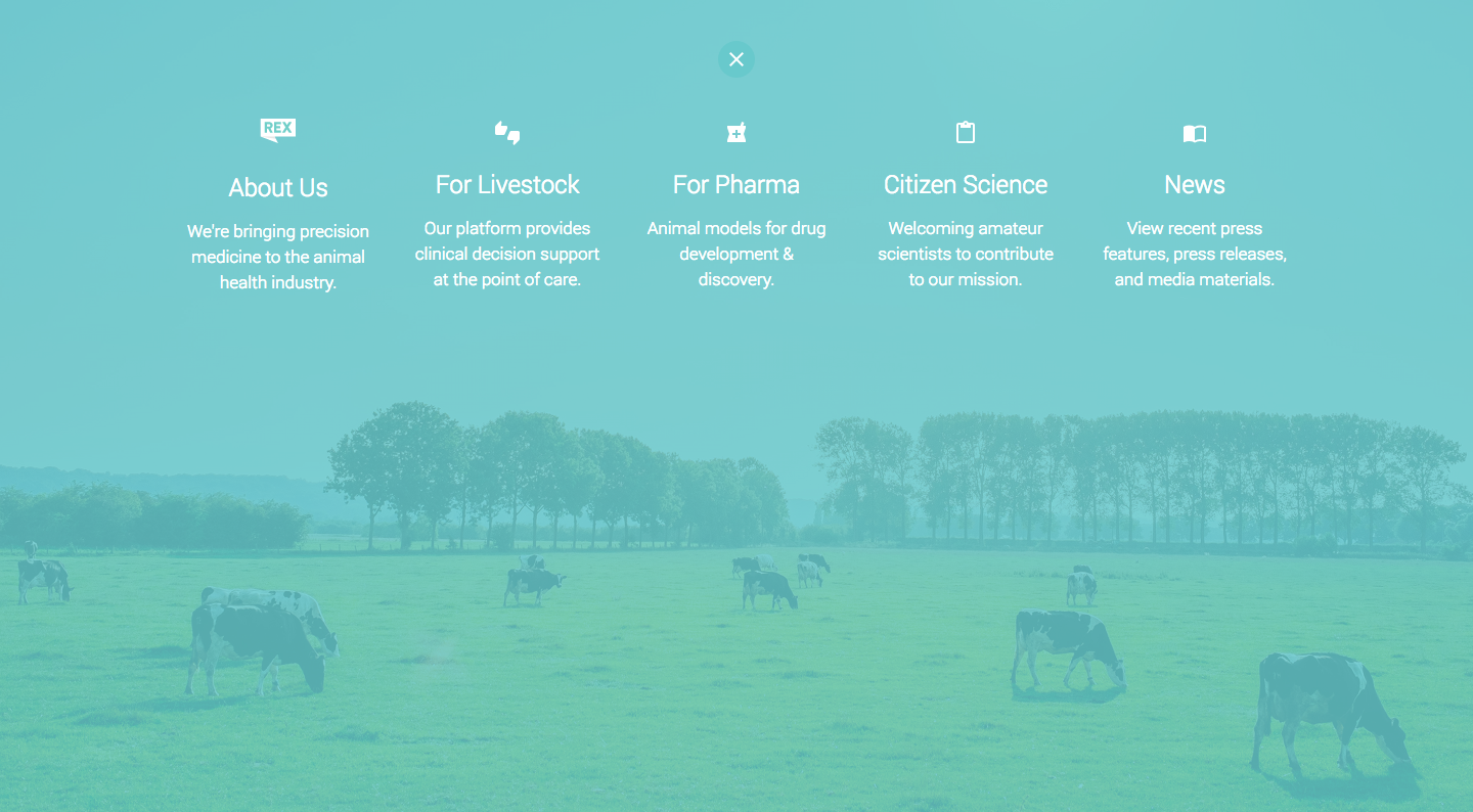
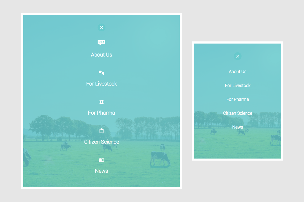
You can check out the finished site here, and, if you’re interested in supporting their mission, consider contributing to the Rex Citizen Science Project.