close
Build-a-Brand
Developing packaging concepts for a new brand of ultra-light beer
settings Product DevelopmentDuring the course of my management training program at Anheuser-Busch InBev, our training class was split into two competing groups for what amounted to a capstone project. Called “Build-a-Brand”, the objective was to develop a new beer and all of the production plans, packaging, consumer personas, marketing strategy, business plan, etc. necessary to bring the beer to market. The project was an opportunity to put everything we were learning to use, while working within the stagegate validation process used by the innovations group when developing new products. We had ten months to develop and test our concepts, culminating in a grand reveal for management in attendance at our graduation ceremony at the end of the training program.
The guidelines of the project dictated that we work to develop a line extension for one of Anheuser-Busch’s flagship brands. My group (“Team Hops”) elected to work on the Michelob Ultra brand, excited by the challenge of developing a product to expand the brand’s appeal while reaching a younger hipper generation of drinkers. Our early research revealed that while Ultra’s active/healthy lifestyle branding appealed to many young adults, they considered Ultra to be something their parents drank – not cool. Furthermore, many of these active young adults were either looking for fuller-bodied more flavorful beers (craft offerings) or preferred other alcoholic beverages to beer.
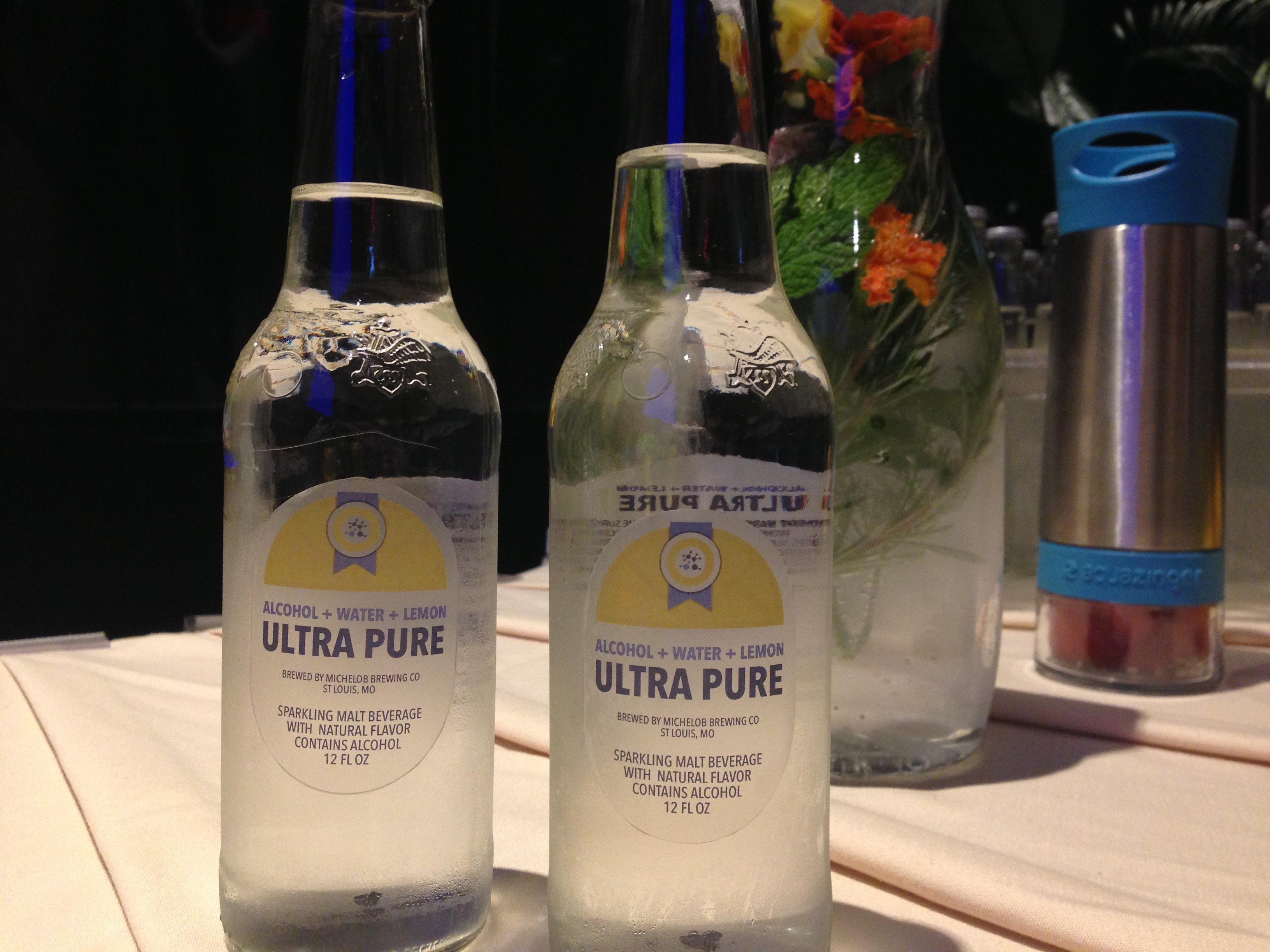
With this in mind, we set to work on liquid development (something I’m going to keep details scarce on), ultimately landing on a crystal clear lightly carbonated beverage with a hint of citrus. For our consumers, we had created something light, refreshing, and sessionable unlike any beer they had ever tried. And, operationally, we had created something we knew our breweries were already capable of producing, with limited CAPEX required to expand production capabilities in the event that our project became a reality. With our first sips of the test batch we brewed, we need we’d found liquid gold.
As we continued to tweak and refine the formulation, with an eye towards shelf-stability, repeatable quality, and ingredient procurement, we continued rounds of market surveys to hone in on the proper branding and positioning for the product. Our initial concepts were relatively conservative. While focusing on concepts reflective of the lqiuid itself (clean, crisp, etc.), we didn’t stray far from the established Michelob Ultra brand guidelines.

While our research showed that consumers viewed these updates favorably, it also revealed that we needed to further differentiate the branding of our new product. In staying true to the parents brand, we were still encountering the existing baggage that young drinkers had associated with it. They were looking for something bolder, cooler, and just flat out different from what they saw in their parents’ fridges.
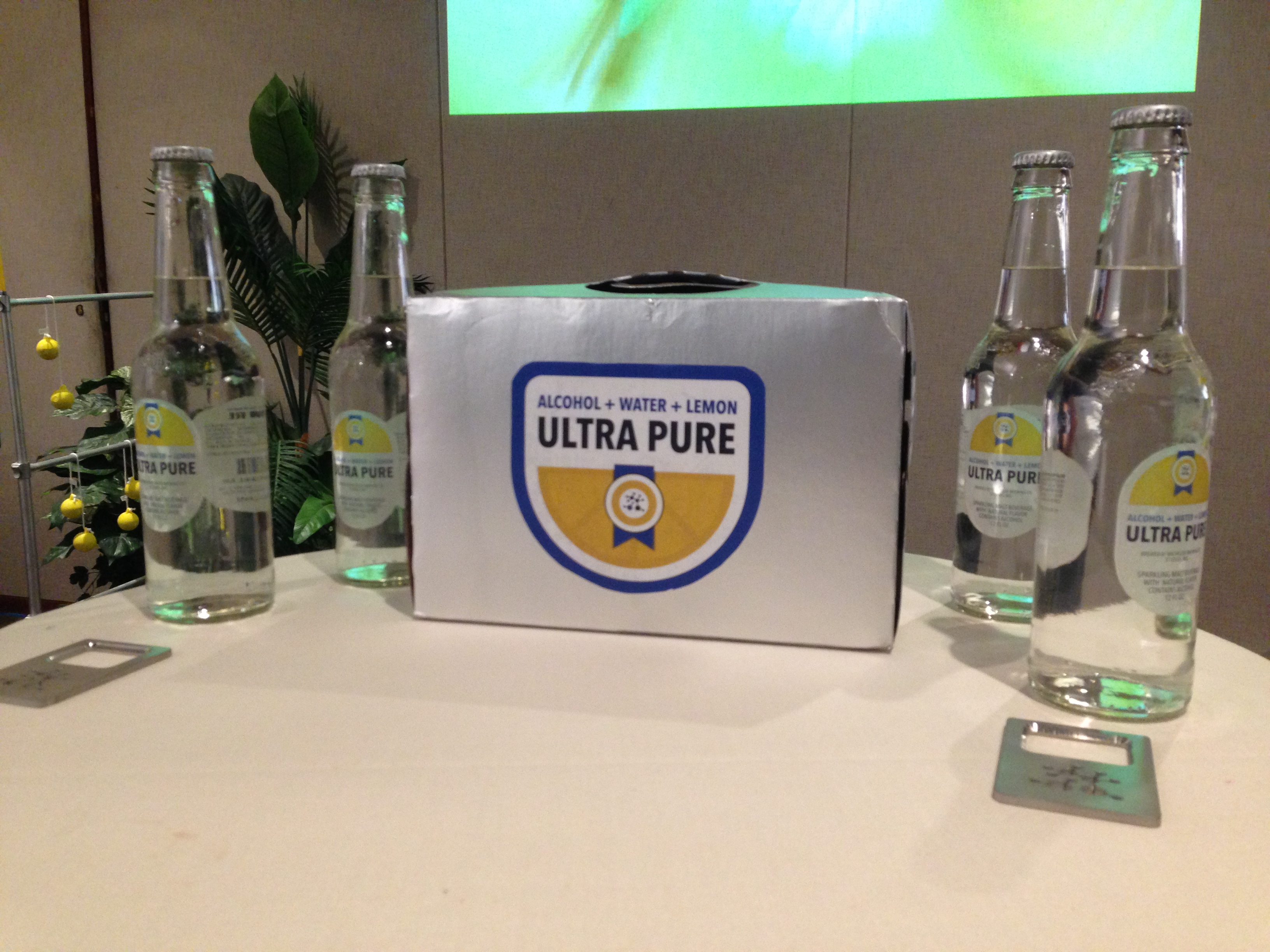
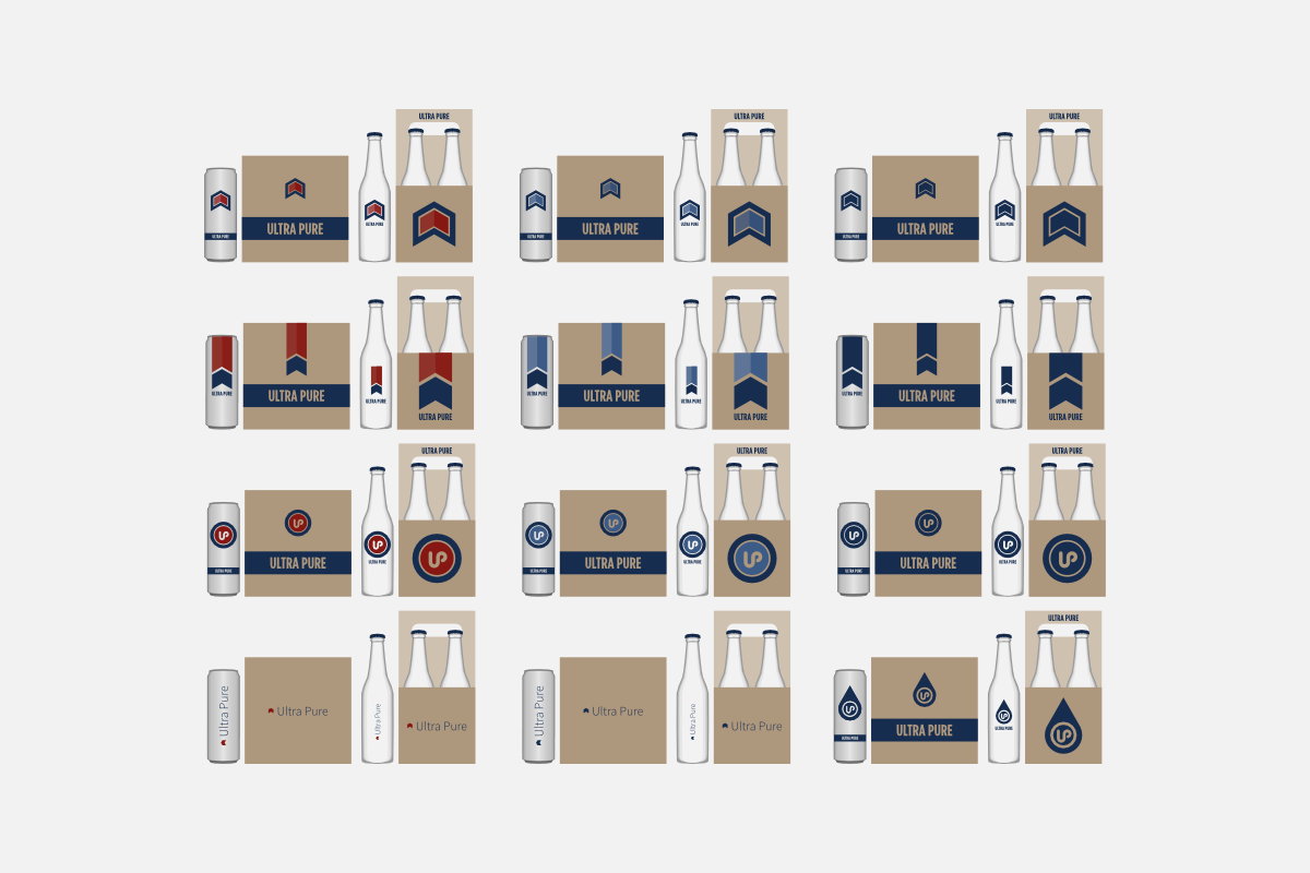
Pushing further from the Michelob identity, we maintained subtle elements as a connection to the parents brand, while better establishing a unique new identity. We abstracted the “arrow ribbon” design that was popular in our feedback, integrated iconography to communicate the pure simplicity of our offering, and developed a fresh color palette.
At this point in our development, we were considering additional flavor expansions, as well as packaging innovations. One of my absolute favorites was 9-pack slim cans packed in a cube. Mirroring the clear glass of the 4-pack longnecks, we even experimented with frosted plastic packaging to give consumers a peak at the contents of the cube packages. While very cool, we ultimately abandoned them as they would add undue complexity to the manufacturing process.


With another round of consumer feedback, we were finally narrowing in on the proper visual identity for Ultra Pure. Our latest iterations had proven too techie/modern for our target audience. However, we were able to use that feedback to reincorporate elements from previous design concepts to strike the right balance between new and old.
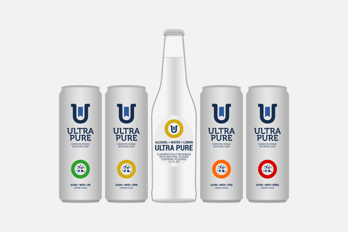

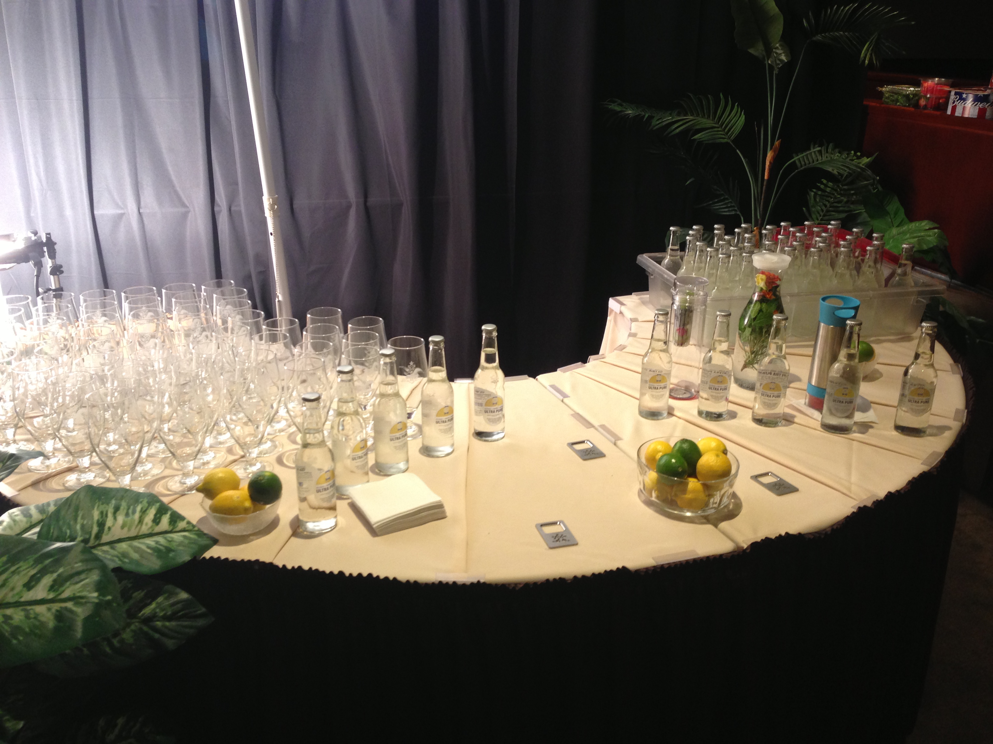
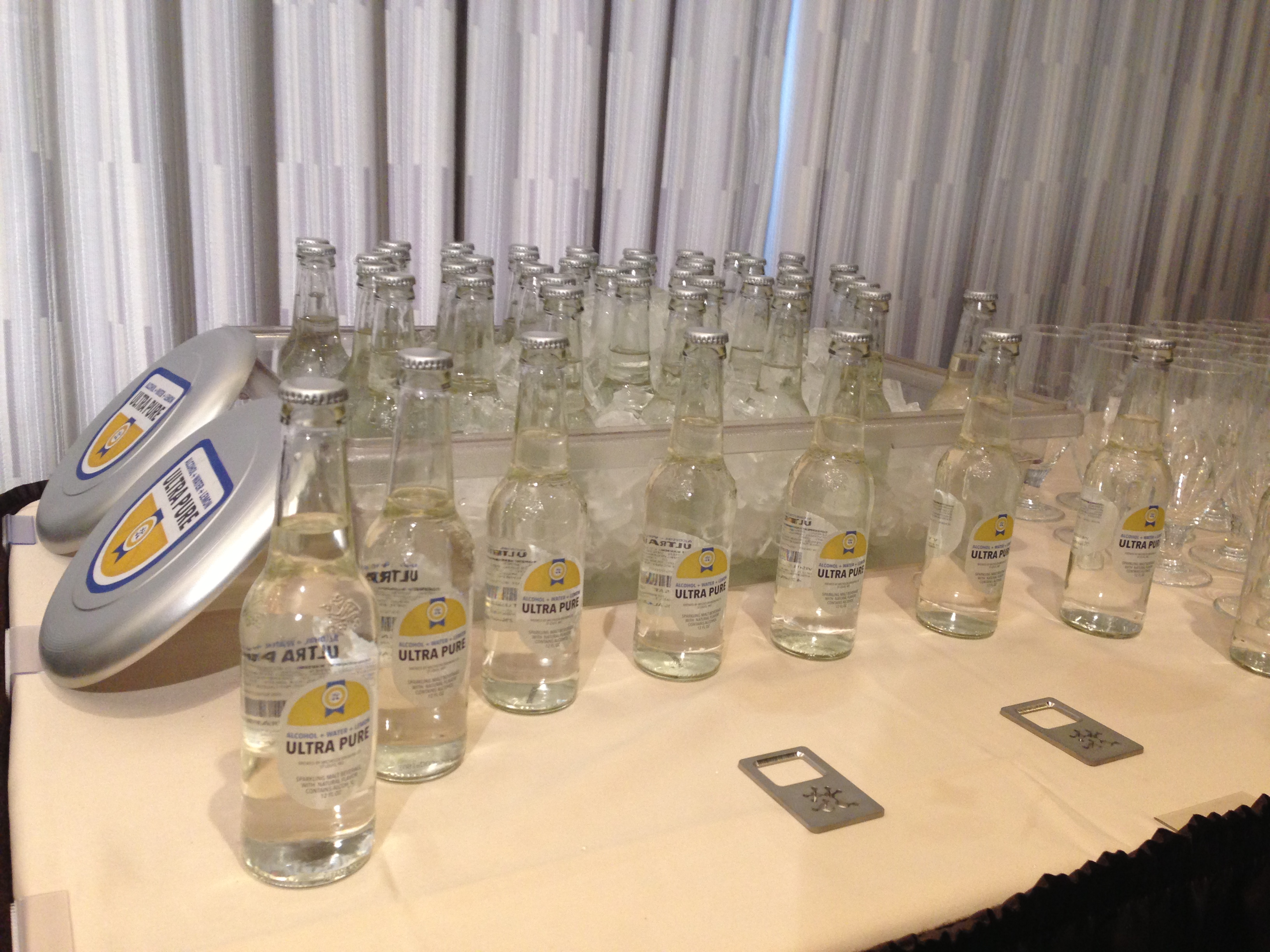
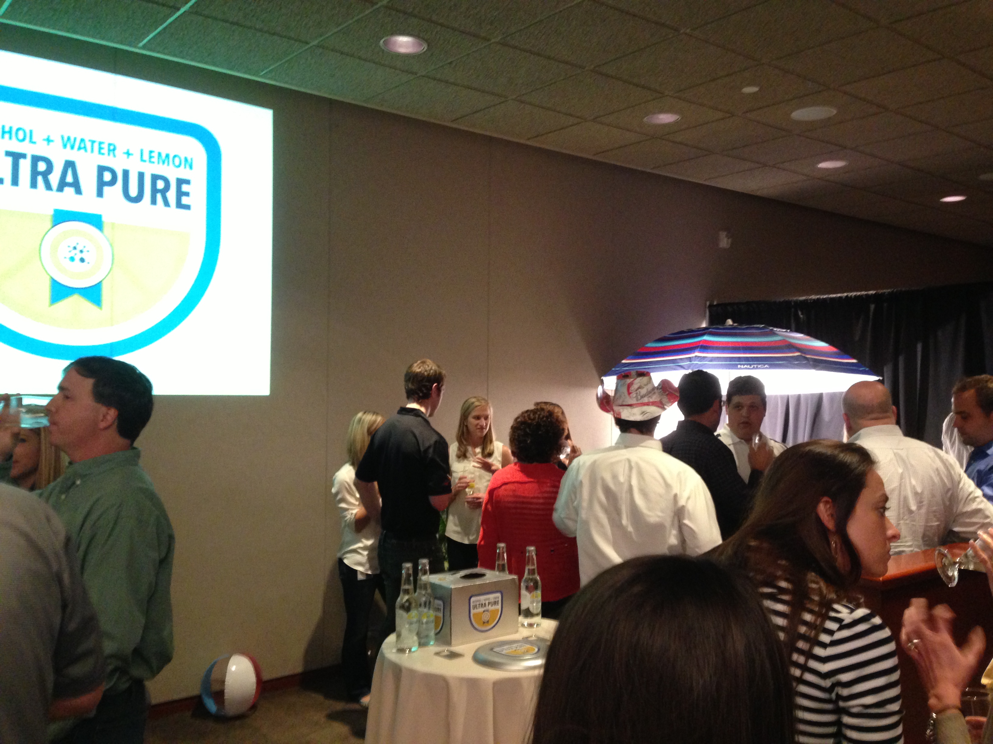
As we hit crunch time, with just a week left until final presentations, we narrowed in on the final design. We were all thrilled with the final result, especially once we slapped our first labels on the freshly brewed and bottled product. With the final idenity locked down, I set to work to whip up physical packaging mock-ups, handouts, a launch website, and custom bottle openers to hand out at the final presentation.

Ultra Pure was a huge hit at the launch event, as were the bottle openers. Our team had a blast sharing the culmination of almost a year of hard work and receiving so much positive feedback from folks who’ve spent their whole professional lives making and selling quality beers. That night we celebrated with most of the remaining stock from our pilot batch and hid a few away to be enjoyed at a future date. A buddy and I recently cracked one open, now nearly two years since it’d been brewed. And I’m pleased to say it was just as delicious as the day it was bottled.